Most outlines are lists. Numbered bullet points marching down a page, one after another, giving you the comfortable illusion that your story moves in a straight line. But stories are not straight lines. They branch. They converge. Subplots weave through the main action, characters make choices that ripple forward in unexpected ways, and a single scene can pay off three different setups from fifty pages ago.
A linear outline cannot show you any of that. A visual plot map can.
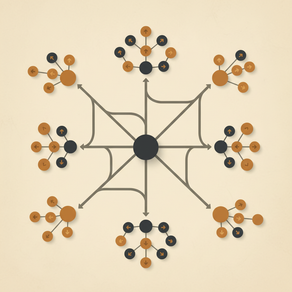 A visual plot map: story events as nodes, with arrows showing how they cause and connect to each other. Clusters represent subplots that feed into the main storyline.
What Is Visual Plot Mapping?
Plot mapping is a way of laying out your story as a network of connected events rather than a sequential list. Think of it like a flowchart for your narrative. Each node represents a story event, a scene, a beat, or a turning point. Each edge (the line connecting two nodes) represents a causal or thematic link between those events.
The key word there is causal. Not just "this happens, then this happens." Rather: "this happens because that happened." That distinction matters more than most writers realize until they try to map it out.
When you place your story events on a canvas and draw the connections between them, you are forced to answer a question that linear outlines let you dodge: why does this scene exist, and what does it connect to?
Why Spatial Layout Beats a Linear List
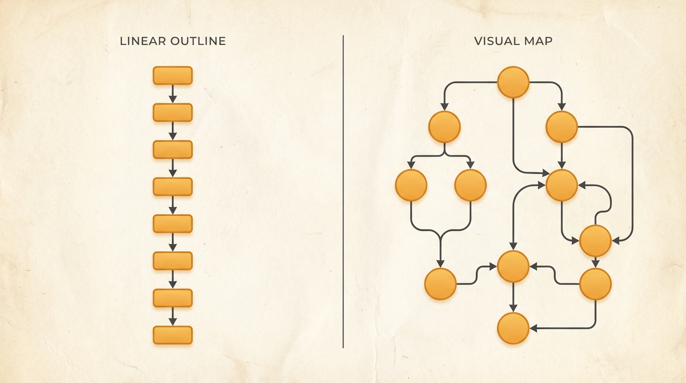 Left: a linear outline, one event after another. Right: the same events as a visual map, with branching connections that show how scenes actually relate to each other.
Your brain processes spatial relationships differently than sequential ones. A bullet-point outline tells you the order of events. A visual map tells you the shape of your story.
Say you are outlining a thriller. Your protagonist discovers a clue in Act One that should pay off in the climax. In a traditional outline, those two events might be forty bullet points apart. You scroll past one to get to the other. The connection between them lives entirely in your head.
On a visual map, you can draw a line from the discovery to the payoff. You can see the distance between them. You can see what other events sit along that thread. And critically, you can see if that thread just... stops. If the clue gets planted and never pays off, the visual gap is obvious. In a list, it is invisible.
This spatial awareness is especially powerful for multi-threaded stories. If you are writing a novel with three POV characters, a visual map lets you lay out each character's arc as a separate track, then draw the connections where their stories intersect. You can see at a glance whether one character disappears for too long, or whether two storylines never actually influence each other.
Structural Problems a Plot Map Will Catch
After working with visual maps across multiple projects, certain patterns show up again and again. These are the problems that are genuinely hard to spot in a traditional outline but become obvious the moment you lay your story out spatially.
Subplots that go nowhere. A subplot that gets introduced but never resolves will show up as a cluster of nodes with no outgoing connections to the main storyline's resolution. It just sits there, unconnected, making its incompleteness visible.
Cause-and-effect gaps. Sometimes two events feel connected when you are writing them, but when you try to draw the edge between them, you realize the connection is not actually there. The character's decision in Scene 12 does not follow from anything in Scene 8. The map forces you to make the link explicit or admit it is missing.
Lopsided pacing. Six major events bunched in Act Two and almost nothing in early Act Three? A visual map makes this immediately apparent. Dense cluster here, sparse stretch there. You feel the imbalance instead of scrolling past it.
Scenes doing the same job. Two scenes serving the same narrative function will sit in the same position on the map with identical connections going in and out. The redundancy becomes obvious. Cut one, combine the best elements, move on.
Fragile plot bottlenecks. If your entire plot hinges on one event, your map will show a single node with an absurd number of edges. That is a sign your story might be structurally fragile.
How to Start Plot Mapping
You do not need to map your entire story on day one. Start small.
Start with what you know. Put your major turning points on the canvas first. The inciting incident, the midpoint, the climax, the resolution. Just those four or five nodes. Then draw the causal connections between them. Already you will start to see the skeleton of your story.
Add subplots as separate clusters. Place your B-story and C-story events near but separate from the main plot. Draw connections where subplots feed into or are affected by the main storyline. This is where dangling threads become visible.
Work at the right level of detail. Map at the beat or sequence level first. You do not need individual scenes yet. As your story solidifies, zoom in and break beats into scenes.
Color-code by character or subplot. Use color to distinguish different narrative threads. This makes it easy to scan the map and see how much space each thread occupies.
Revisit and revise. A plot map is a thinking tool, not a finished artifact. Move nodes around. Delete connections that are not working. The map should evolve with your understanding of the story.
Tools for Visual Plot Mapping
Writers have been doing versions of this with index cards on corkboards and sticky notes on walls for decades. The limitation of physical tools is that they do not scale well. Once you have sixty cards on a wall, rearranging them and tracking the connections between them becomes unwieldy.
Digital tools solve the scaling problem. General-purpose tools like Miro or FigJam can work, but they are designed for business workflows, not storytelling. You end up spending time building the structure that a purpose-built tool would give you out of the box.
Scyn was built specifically for this kind of work. It gives you a canvas where story events are nodes, connections between them are explicit and editable, and the whole thing is designed around how writers actually think about narrative structure. If you have tried whiteboarding your plot and wished the whiteboard understood what a subplot was, it is worth a look.
What changes when you can see the whole thing
The point is not to produce a pretty diagram. It is to change how you think about your story. When you can see the whole structure at once, you make better decisions about what to cut, what to expand, and where the gaps are. You stop relying on your memory to track every thread and start relying on a system that makes the connections visible.
Stories are not linear. The tools we use to plan them should not be either.